2nd Button Attempt... Nooooooooooooooooooooooooooooooooooooooooooooo
Dont worry should have some proper buttons by this Friday!!
ISIX Legacy Project
Monday, 28 March 2011
Friday, 25 March 2011
Laura Hollis – 3rd Year Glass – Project 4 Design Brief - Existance
This project aims to explore the world of fashion whilst taking a back seat to a certain extent within a design process or collaboration e.g. my work being a background commodity as opposed to being at the forefront of an audiences mind.
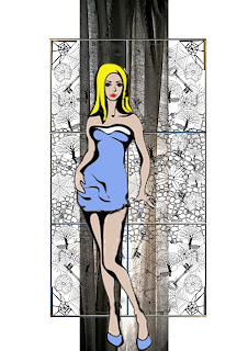
I was approached by six fashion students. They would like to incorporate an accessory specifically made from glass that they can use to unify their body of work for a winter fashion collection.
They would additionally like a piece of glass to incorporate within a photo-shoot to highlight the use of glass in some of the collection and to successfully represent their separate inspiration subjects.
Part of the collaborates design brief includes a requirement for my designs to incorporate a mixture of the individual designers chosen inspiration areas providing me with a whole array of material to focus on. These subjects include:
· Curiosity of the Mind – man’s relationship with nature.
· Cellular Patterns/patterns in nature.
· Stained Glass.
· Artefacts/Collections – & the potential stories they hold.
· Spider Webs.
However the accessories are different in that they are purely aesthetic to a so the main inspiration here is in the shapes used historically and also the groups chosen colour palette too.
I aim to create a series of solid hand-cast buttons for specific clothing items and potentially jewellery pieces or ‘beads’ which could be universally used or alternatively be incorporated into a removable accessory for a garment.
This should provide me with a knowledge base for potential future commissions in a separate field to my usual way of working with glass as a material.
Additionally for the main design which is to be used within a photo-shoot I wish to design and build a photographic backdrop using a mixture of contemporary screen-printed glass plus traditional leading techniques.
This should enable me to further develop my technical skills in silk-screening onto glass and knowledge into the structural properties of making a large-scale leaded panel. It also provides with a new set of architectural challenges here with regards to practical stability and the type of physical construction used to create and display this kind of an item.
Thursday, 17 March 2011
Wednesday, 16 March 2011
Legacy collection - Kate
Hey Guys
Here are my two outfits. I am using brown, grey, salmon pink and splashes of beige and red/burgundy. I am using the brown and salmon pink wool that Jackie is using. Please let me know if you think the colours do not go and I can always rethink it.
Monday, 14 March 2011
Hey group!
Can everybody put up their two final outfit illustrations by wed. evening? (In high quality) Me and Katie will print them out on a sheet for our presentation. We need to be as professional as possible for this monday. Also me and Katie will print out tags for each outfit (12) for fabric samples to be attached to. We think we also need a big sheet with a more general colour/fabric pallette to show what we have been looking at and our colour direction aswell as the tags. We thought if we present this with a chosen logo for a professional look we will stand a better chance at getting the okay to continue, and we havnt shown the tutors what we have been thinking about before (on paper.) Then we will hopefully also get the logo/new name accepted so we can start applying for sponsers and find a photographer and so on. :)
Marie
Marie
Friday, 11 March 2011
Wednesday, 9 March 2011
Brand Identity
Hello, Emma from Graphics here, just posting what i've done so far...
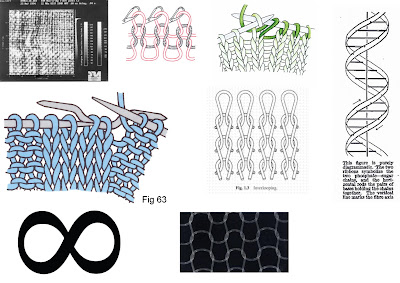
I then focused on the infinity sign as it is a bold image, and ties in the values and main elements of the 'Sia' brand. It is an elegant symbol, that would sit comfortably along with the likes of Pringle, Mulberry, Todds etc. Above is some experimentation with the infinity sign.
I then experimented with typefaces. The top two examples were where I focused on the textural element of the brand, trying to translate this through the font. The bottom three examples I wanted to portray a simple femininity, similar to that of the Chloe brand.
After trying out several combinations of the text and symbol, in the end I favoured the two above, even more so, the one on the left hand-side. I then placed this on a couple of applications...
Above is a visual for a potential website. And below, the envelope for a simple mail-out.
So that's it so far, currently working on the suggestions you made at our last meeting in regards to incorporating roman numerals.
Monday, 28 February 2011
Final collection (Bryony)
Hi girls! Here's my final line up and surface effects. I'm using a mixture of print techniques (screen, digital and possibly hand painting) along with a cut out pattern (which will be laser cut) and also a detail using chain. I'm making outfit 8 (which is light wool top with a manipulated fold detail and also a chain detail, with a long skirt, with a zip off train and a frill detail piece tying at the waist which has zip openings/pockets so it can also act as a handbag! My second outfit will be either number 1 or 7. If I go ahead with no.7 then I think I'd rather just take the shirt/dress and go with a more minimal look and style it on it's own. I'm waiting to get feedback from Claire on all this, so i'll confirm after I've had her feedback! Also I've emailed Laura about the possibility of getting glass beads for the embellishment of the waist piece and buttons for the shirt. Hope you like this! Honest feedback please!!
Monday, 7 February 2011
Saturday, 5 February 2011
Thursday, 3 February 2011
Subscribe to:
Posts (Atom)


