Hello, Emma from Graphics here, just posting what i've done so far...


I then focused on the infinity sign as it is a bold image, and ties in the values and main elements of the 'Sia' brand. It is an elegant symbol, that would sit comfortably along with the likes of Pringle, Mulberry, Todds etc. Above is some experimentation with the infinity sign.
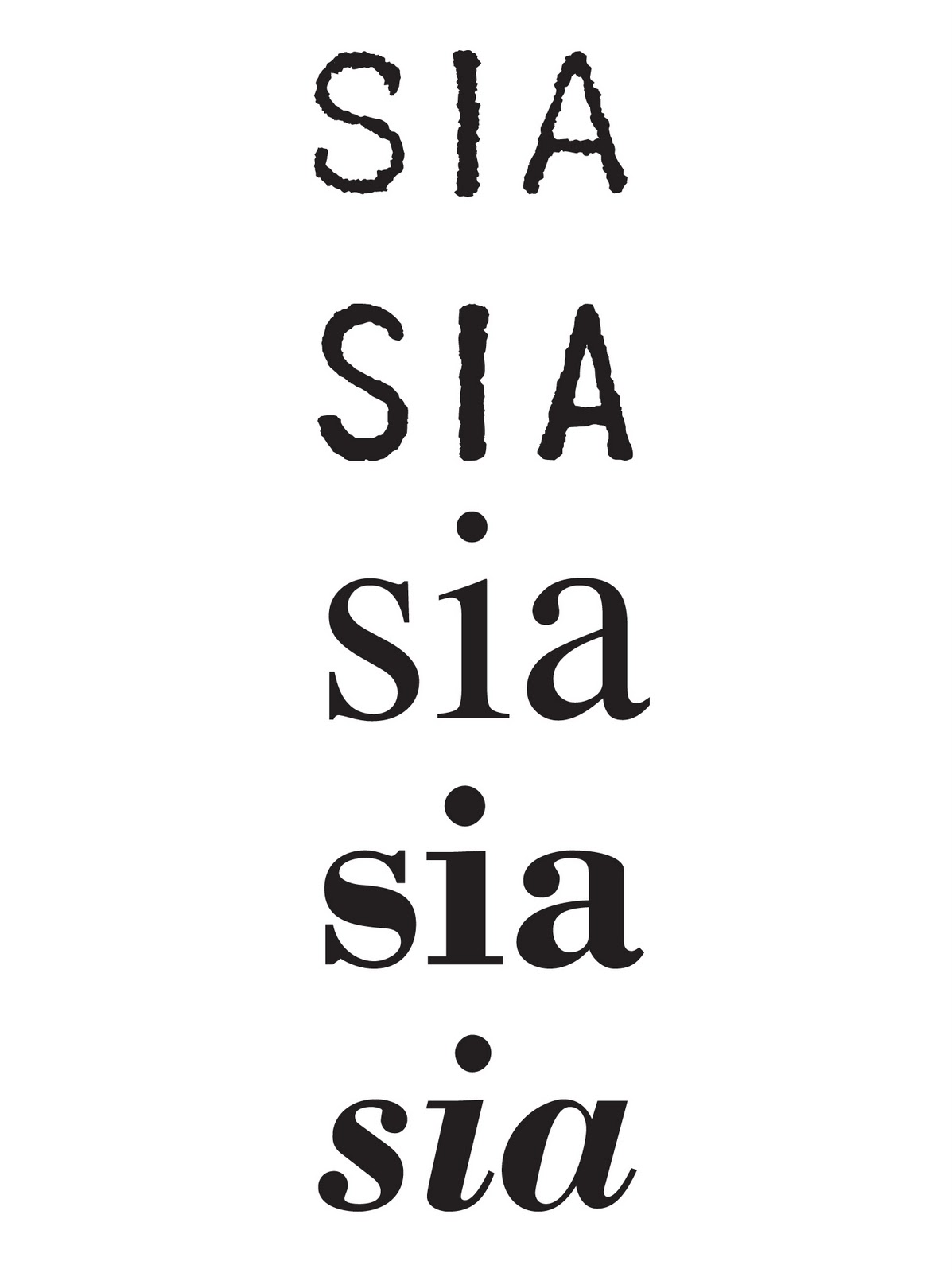
I then experimented with typefaces. The top two examples were where I focused on the textural element of the brand, trying to translate this through the font. The bottom three examples I wanted to portray a simple femininity, similar to that of the Chloe brand.

After trying out several combinations of the text and symbol, in the end I favoured the two above, even more so, the one on the left hand-side. I then placed this on a couple of applications...

Above is a visual for a potential website. And below, the envelope for a simple mail-out.

So that's it so far, currently working on the suggestions you made at our last meeting in regards to incorporating roman numerals.
Hey, I really like it! It is minimal and suits in with our brand philosophy =) Love the look of the website
ReplyDeleteMarie
Really like the motif symbolsing infinity, cool interpretation of our key words.
ReplyDeleteKatie
The motif looks lovely, and looks great on the envelope, only thing i'd day is that I think it would be good to have the name under the motif like you have somewhere else. Also, I do really like the web site proposal, but again i'd be a bit concerned that it doesn't look 'luxury' enough. But otherwise I think it's all great. And thank you!
ReplyDeleteBryony =)
PS, with the motif options I like the finer ones better as they're more feminine.
ReplyDeleteBryony